
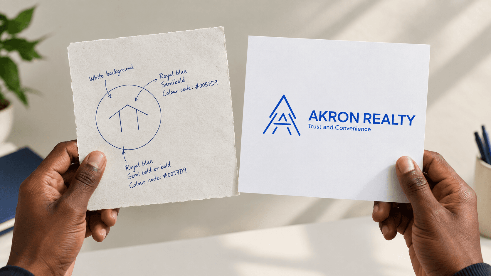
How I Created a Brand Identity for Akron Realty

There is something strangely humbling about design. You can spend hours creating new concepts, exploring different directions, moving things around, questioning your decisions, and convincing yourself that the next idea might be better.
Then, sometimes, you look back at the first thing you made and realise: “Wait. This was actually the idea.” That was pretty much my experience designing the brand identity for Akron Realty.
How it started
Around February 9, 2026, I was contacted through a referral from a previous client. The referral connected me with one of Akron Realty's co-founders, and that conversation turned into a brand identity project.
At the beginning, I didn't want to jump straight into designing. I wanted to understand what the co-founder had in mind.
So, I asked questions about their preferences, how they wanted the brand to feel, and what they wanted people to perceive when they encountered Akron Realty.
One thing became clear from those conversations, they wanted simplicity, but not the kind of simplicity that makes a brand forgettable. They wanted something outstanding, something distinctive, something that could be recognised easily without having to explain itself. And that became the foundation of my creative direction.
Finding the idea inside the name
One of the directions provided from onset was to use the initial "A" from Akron. I liked the idea because the letter gave us something familiar to work with while still leaving enough room for interpretation.
The challenge was turning an ordinary "A" into something that could represent a building. Not just another house icon, or another predictable roof-and-door symbol.
The brief actually pushed this idea further as the founders wanted the building representation to feel slightly alien-inspired, something that felt like a form people hadn't seen repeatedly, while remaining simple enough that even a child could sketch it by hand.
I explored more than six or seven different samples of how the letter A could become a representation of a house or building. Some ideas felt too extra while some looked too conventional like real-estate logos. Others were visually interesting but lost the simplicity we were looking for.
This was probably the part where I spent the most time questioning myself because I wanted to create something that would please everyone who saw it. And, honestly, it wasn't helping. At some point, I realised I was designing for the imagined opinions of everybody rather than designing according to the standards and principles I had developed as a designer. That was one of the things I got wrong. You can't always design something that pleases everyone. You have to design something you believe works, and then be willing to listen, test, correct and refine it. That shift in thinking changed the process for me.
Going back to the beginning
Interestingly, after exploring different directions and collaborating with the co-founder, we eventually returned to one of the foremost concepts that was created.
The idea was already there. It just needed refinement. This was one of my favourite moments in the project because it reminded me that exploration doesn't always mean moving further away from your first idea.
Sometimes, you explore extensively just to understand why your first instinct was right. The final icon became a simplified representation of the letter A and a building, brought together into a single mark. That was the point where Akron Realty started to feel like a brand rather than simply a logo.
Collaboration changed the outcome
The co-founder's feedback played a huge role throughout the process. There were moments where I had to reconsider a direction I personally liked. There were also moments where feedback helped clarify what the identity was actually supposed to communicate.
One of the most useful pieces of feedback came near the end of the process: "We will revert back to the original idea as a foundation for the final iteration of the logo." And that was exactly what we did. That experience reinforced something I think every designer eventually learns: Collaboration doesn't weaken your creative voice. The right collaboration sharpens it.
Discover more from AKRON REALTY blog
Subscribe to get the latest blog posts sent to your email.